You signed in with another tab or window. Reload to refresh your session.You signed out in another tab or window. Reload to refresh your session.You switched accounts on another tab or window. Reload to refresh your session.Dismiss alert
🎊 React-Form-Toaster is a powerful and flexible library designed for creating dynamic forms in React with ease. Users can quickly generate complex forms by simply defining input types, buttons, and other elements, without needing to create each element separately.
Easy Setup: Get started in less than 10 seconds! Quickly integrate and begin creating dynamic forms without hassle.😎
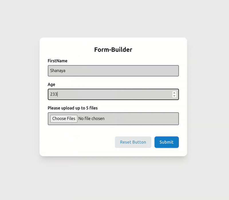
Dynamic Form Creation: Simply define the type of fields, labels, form title, and required attributes, and the library handles the rest.
Highly Customizable: Customize every aspect of your form, including classes, messages, and more, to fit your specific needs.
TypeScript Support: Built with TypeScript, ensuring strong typing and safer code development.🤯
Tailwind CSS Integration: Optimized for Tailwind CSS, allowing for efficient and modern styling right out of the box.
Default Form UI: Comes with a beautifully designed default form UI that you can use as-is or customize further to match your design requirements.
Form Validation and Error Handling: Easily define required fields and validate user input with built-in error handling and custom validation functions.🍃
Responsive Design: Fully responsive, making it easy to create forms that look great on any device.
Zod Validation: Easily apply Zod validation in your Form🔐.
Fully Customizable Forms: Provides the flexibility to design forms with custom classes and styles, ensuring they match your application's theme.😱
Note: It is important to import index.css after App.tsx to ensure that all styles are correctly applied. This ensures that any global styles are loaded after the component has been imported.
constvalidationSchema=z.object({firstname: z.string().min(4,{message: "First name must be at least 4 characters"}),age: z.number().min(18,{message: "You must be at least 18 years old"}),});
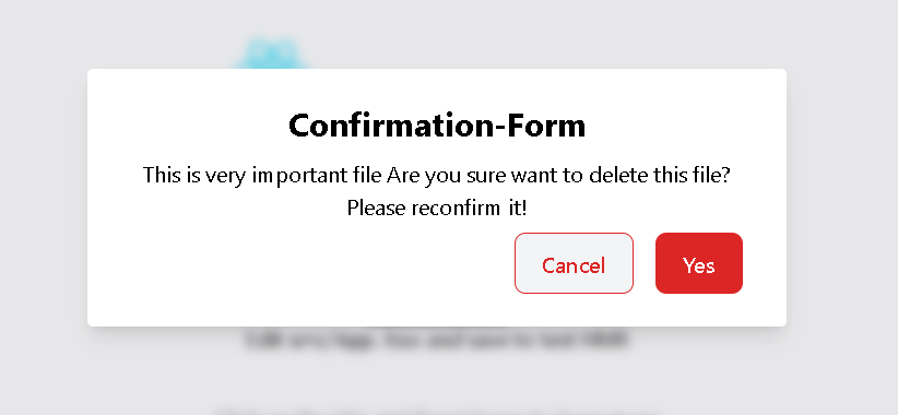
Confirmation-Forms
 <Formbox
 formtoogle={setsecondform}
 formtitle={[{
 title: "Confirmation-Form",
 }]}
 message={[{
 message: "This is very important file Are you sure want to delete this file? Please reconfirm it!"
 }]}
 buttons={[{
 name: "Ok",
 label: "Confirm",
 type: "ok",
 function: () => handleConfirm(true),
 className: ["bg-red-600"]
 },{
 name: "Cancel",
 label: "Cancel",
 type: "cancel",
 function: () => handleConfirm(false,200),
 className: ["text-red-600 border-1 border-red-600 bg-gray-100 hover:border-red-600 "]
 }]}
 />
consthandleConfirm=(confirm: boolean,productId: number)=>{console.log(confirm,productId);if(confirm&&productId){console.log(" We got both of them. Hurrah! 🏆 ");}setsecondform(false);};
Component Attributes
The following tables detail all available attributes for each component in React-Form-Toaster:
Formbox Component Attributes
Attribute
Type
Description
Required
className
string[]
Custom classes for the form container
No
formtoogle
Function
Function to toggle form visibility
Yes
formtitle
Object[]
Form title configuration
No
textfield
Object[]
Text input field configurations
No
buttons
Object[]
Button configurations
No
message
Object[]
Message configurations for confirmation forms
No
validationSchema
Object
Zod validation schema
No
loader
boolean
Whether to show loader on submit
No
TextField Component Attributes
Attribute
Type
Description
Example
name
string
Input field name
"firstname"
placeholder
string
Placeholder text
"Enter your Firstname..."
label
string
Label text
"FirstName"
type
string
Input type (text, number, file, etc.)
"number"
required
boolean
Whether field is required
true
arialabel
string
Accessibility label
"FileUpload"
accept
string
Accepted file types (for file input)
".pdf, image/*"
maxFiles
number
Maximum number of files (for file input)
5
selectlabel
string
Label for file selection (for file input)
"Select File pdf or image"
passwordToggle
boolean
Whether to show password toggle icon (for password input)
true
icon
Object
Icons for password toggle (for password input)
{ show: Eye, hide: EyeOff }
checklimit
number
Maximum number of checkboxes that can be selected (for checkbox input)
 React-form-toaster